


Back in October, I wrote about Sugar Paper Los Angeles’ Target collection. One of the images I featured included a brass snail letter opener and ruler, and I assumed they were just vintage props.
Well, I couldn’t have been more wrong (in a good way) — they were actually a glimpse into Sugar’s latest range, to be officially unveiled in a few weeks at National Stationery Show. Now Chelsea & Jamie have given TPC an exclusive sneak peek at this solid brass line of desk accessories (not to mention their other fabulous new releases), so you don’t have to fight the crowds in their booth to see it — not yet, at least!
Chelsea shared the inspirations for the desk collection. “The spark came from a stamp roll sitting in my drawer,” she told me. “Jamie and I were discussing how both our moms had stamp roll holders on their desks when we were growing up and we starting searching the market for one. We were able to find the item, but only vintage. We decided to bring this item back.
“One thing led to another and we began dreaming up a collection of items. We identified four distinct items that we think perfectly complement the SP line and would collectively create a beautiful desk collection. We decided on a perfectly simple white and gold pen, a ruler like the vintage one we found at a flea market in France, a stamp roll holder like the ones our moms had, and we had always wanted to make a signature letter opener.”

Speaking of which, “The snail mail opener is our favorite item in the collection,” Chelsea told me. “The design is inspired by a children’s toy. It’s meant to be a beautiful and functional object that lives on your desk. It’s intended to be a modern heirloom that can be passed down from mother to daughter, given as a gift, etc.”
I feel like the brilliance of these pieces lays with the fact that they infuse any desk with a timeless chic — and no matter what your paper looks like, any stationery lover needs a stylish place to pen correspondence & read what is received— and, perhaps more importantly, to feel well-appointed while doing so.
 I can’t end this post without sharing some more highlights from Sugar Paper’s new catalog (not available yet, but very soon). I suspect these will top many must-have lists in the coming months!
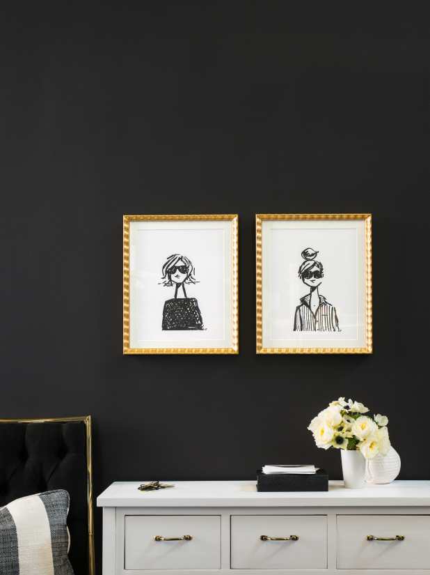
First up are a series of illustrations of what Sugar Paper calls the SP Girls. Available on letterpress prints as well as on letterpressed notesets on double-thick paper with gold bordering and hand-lined envelopes, they are the result of a collaboration with illustrator Jennifer Vallez.
“We started by asking her to create some postal icons for us,” Chelsea recalled. “She sent a couple of rough sketches that we loved, but we felt like something was missing. We spoke on the phone and I said, ‘I feel like we’re not truly utilizing your talents. We love the postal icons, but we know your passion lies in fashion illustration.’
“Long story short, we talked to her about the Sugar Paper client — who she is and what she stands for. We ended by saying, ‘OK. Let’s try something different. I’m not sure this will be right for us, but let’s see …’ Famous last words.
“Thirty minutes later she sent us three quick sketches and we went wild. I called her back and said, ‘We love them! Ink them.’ She laughed and said, ‘You don’t have any changes? You don’t want me to clean them up?’
“‘Nope,’ I said, ‘we love them exactly as they are. They are perfectly imperfect and will press beautifully in black ink on a letterpress.’ I think some of the best work comes out of the world this way. People who admire one another and allow they other person to do the work they do best.
“In terms of the qualities we were trying to capture, it’s hard to explain,” Chelsea described. “The SP client is a woman who is effortlessly chic, who has good manners, and requires quality. She’s preppy, but not boring, stylish without being trendy … We always say that we make high quality paper goods for high quality people. I think that sums it up quite nicely.”
I agree, but check these girls out & decide for yourself!


There’s plenty to swoon for in the 72-page catalog. The black, white, gold and kraft vibe is still strong — clean, posh and very cool. 


I think this may possibly be the chicest blotter I’ve seen — the die-cut shape is beyond elegant, and I love that SP has brought dated product into their boutique line.

The palette even extends into holiday offerings, such a fresh (and welcome) spin!
There is a not complete absence of color here, though — this coral and icy pale blue combined with silver & gold foil feels so very enchanting & unexpected!
And, I was never a big fan of peach … until now that is.
I think you’ll agree the SP girls have been quite busy this past year!
I for one can’t wait to see it all in person in Booth 1831 at NSS. I feel I won’t really truly experience the range until I feel the heaviness of the stamp roll holder in my hand, or run my fingers over the letterpress impression and thick papers.
So, if we run into each other in the busy booth, be sure to say hi! And, be sure to look for this in your favorite stationery shop in the coming months.

[amazon_link asins=’B01KQKFJ4K,B06Y5P62NH,B01KQGH3KW,B073VT933G,B01KQGH7HG,B01N5QZ0JA,B079JJL9BP,B01H0UUR0A’ template=’ProductCarousel’ store=’us0479-20′ marketplace=’US’ link_id=’12659e91-2b69-11e8-bf46-5fb0fe28c4e7′]

