


Well the judges have judged, and the votes have been tabulated, so it my distinct pleasure and honor to share this year’s crop of Noted@*Noted Award Finalists. The competition was quite intense with a record 238 entries — take it from a judge who left a comment on every last entry, that is quite a lot of cards! Out of 78 makers who entered, 24 are finalists, so those makers who advanced to the finalist round should be doing a very merry happy dance about now.
This is all the editorializing you will get from me until the end of this post; the copy below each design was submitted for the judges to consider alongside the card.

Best Color Combo

Inspiration behind design?
“I grew up in Rio de Janeiro, Brazil, and this pineapple lady was inspired by our Carnaval’s bold colors, fun over-the-top costumes and overall spirit. The pineapple suit and bright unexpected color combo bring me back to the ‘be yourself/treat yourself’ vibe of those fun summer days.” — Lucia Saisse Morris

Inspiration behind design?
“On a rare occasion a card pops into my head fully formed — this is one.” — Karen Sawyer-Meehan

Inspiration behind design?
“Take yourself back to the early 2000s with this bright birthday card, whether or not you’re celebrating in da club or with sherbert!” — Kate Murray

Best New Product Line


Inspiration behind range?
“We’ve been working to bring this format to our line for more than 18 months and are thrilled to finally debut this collection of cards in 2023. We love how these extra panels provide the opportunity for more story telling, more color, more artwork (a much longer canvas) — furthering the idea of a card as artwork: something people will cherish and display for years to come.” — Brad Woods


Inspiration behind range?
“This product came as a natural progression from the Zero Waste Postcard Calendar we introduced last year. The assortment of twelve postcards is the perfect way to highlight the incredible artwork from many of the artists we work with. Selfishly, it is also a way for us not to have to make the hard choices we are often faced with when picking art for our greeting cards 🙂 . Packaging the sets with our seed paper belly band aligns with our commitment to reach zero waste! The premium embossed paper is TREE FREE and the info sheet (the only component you don’t mail) has a bonus 4×6 art print on the back — take the cardboard stiffener, mount your print and you complete your zero waste journey!
“We feel postcard sending is not just something we do while on vacation anymore. Postcard sending is the next best thing to sending a greeting card and there is something special about the message we write being “”out in the open” — honest, exposed: “This is me letting you (and everyone else!) know that you are special to me, that I miss you, that I am thinking of you, that I love you….””


Inspiration behind range?
“Introducing Open Sesame, our newest greeting card collection that captures theunconventional! Brighten any mailbox with these whimsical notes filled withthoughtful design twists. Each card is one-of-kind, but not to worry — they all fit
into 5”x7” mailable envelopes! This collection is exclusive to independent retailers
for one year and can be sold in-line or in our 12-pocket display.” — Sarah Kunst

Best Pattern

Inspiration behind design?
“Apples and pencils, oh my! Hand painted apples, pencils, and leafy greens complimented with chalk style illustrations create a harmonious pattern set on a blue background.” — Nadine Chong

Inspiration behind design?
“I truly love hand printed patterns and all the greens are my favorite colors. So the combination of a hand printed pattern, all the greens and the pop of orange poppies in this card make a winning combination for me. This is part of my PNW Forever Wild series of florals on patterned backgrounds that will launch this spring.” — Amy Frazer

Inspiration behind design?
“It may not polka, it may lack stripes, and it has no checkered past but this Western Toile has everything Southwest going on! We love the color palette and the use of empty spaces and discovering new details every time we pick up this card.” — Libby Llanso

Freshest Vibe

Inspiration behind design?
“This design comes straight from my kids. They truly DO love their teacher this year, and I wanted a more personal thank you card for them to give that spells out just how they feel! And then of course, I wanted to paint some fun letters 🙂 This card has been flying out in orders since it’s launch, which makes us so happy!” — Emily King

Inspiration behind design?
“Every new mom wants to be the cool mom. We created this card for the woman who doesn’t want to be labeled or defined by her pregnancy. The many colors in this rainbow-colored honeycomb tissue sphere are even more vibrant and fun in person!” — Lindsay Henry

Inspiration behind design?
“I grew up playing card games with my dad, spent my teenage years playing euchre (yes, I’m from Michigan) and play solitaire just about every day still. I look at playing cards A LOT which inspired this little cutie.” — Kellie Brubaker

Funniest

Inspiration behind design?
“An anniversary card for those of us who are so grateful to have found our special someone – but know they should be thanking their lucky stars for us as well. Released in January, this card has been an instant hit!” — Sam Kramer

Inspiration behind design?
“This card has been an unexpected best seller since it was released earlier this year. What I thought might be too inappropriate of a design, has been getting lots of laughs (and I’m here for it).” — Samantha Rekas

Inspiration behind design?
“A counterbalance to all the saccharine odes to SuperMoms, this card celebrates moms who did their best, even if it never felt like enough.” — Christine Byrne

Most Fantastic Floral

Inspiration behind design?
“Apache Plume is native to the Southwest and their spring and summer blossoms transition to fall and winter feathers. They manage to be perfectly delicate while also sturdy enough to survive in the desert. I always enjoy seeing them in the wild and thought they’d make a lovely card design.” — Michelle Hart

Inspiration behind design?
“We were in Florida for my birthday and I was reading a novel. I looked up and noticed the lovely the floral landscape. It made me create my own birthday card.” — Christy Asper

Inspiration behind design?
“Something bright, happy and beautiful for all the Grandmas out there. I feel like there is a lack of freshness for Grandma cards and I wanted to be able to offer some newness to this category.” — Marie Castiglione

Most Marvelous Creature

Inspiration behind design?
“This is a portrait my big, fat, black cat (wearing a hat).” — Karen Sawyer-Meehan
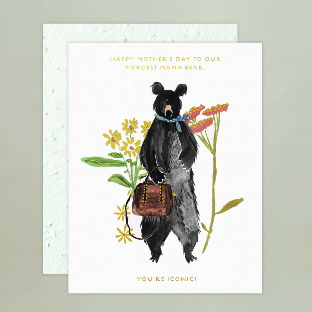
Inspiration behind design?
“We love the juxtaposition of the fierce yet fashionable Mama Bear! How can she not be the unofficial mascot of *Noted 2023? She represents the fierceness of our (mostly!) women owned publishers. She balances her roles, be they mother, maker, or business bear, who truly do it all and still find the time to support, lift and protect all the members of the pack.” — Libby Llanso

Inspiration behind design?

“This card is the most autobiographical card in my collection and definitely came in handy this year at Valentine’s Day. Between all my plants and our two cats vying for our attention, he still wins out.” — Chelsea Ward

Punniest

Inspiration behind design?
“A big round hippo is guaranteed to put a smile on their face! Wish them a hippo birthday with this fun pop-up card.” — Lindsay Henry

Inspiration behind design?
“Another year older means adding another plant to the collection, right? My ideal birthday card, complete with a watercolored terrazzo floor.” — Chelsea Ward

Inspiration behind design?
“Punny phrase we’re always using!” — Sarah Kunst

Snarkiest

Inspiration behind design?
“As both Lesley & I are moms, we know the joy that comes with motherhood. But while being a mom is fulfilling, it can also simultaneously be the hardest, most soul sucking job you’ll ever have. Privacy? Peace & quiet? Self care? What even are those? This card perfectly captures the exhaustion and humor of being a mom.” — Tracey Wikenhieser

Inspiration behind design?
“Based on my experience, during difficult times, acknowledging how terrible the situation is can be more comforting than empty platitudes or advice. I created this card as a humorous but honest way to recognize the gravity of what someone is experiencing, without trying to sugarcoat or find a silver lining. Essentially, the card is a concise and funny way to say, “This is the fucking worst, and I’m so sorry you’re going through this.” — Janine Kwoh

Inspiration behind design?
“Humor” — Sarah Kunst

Wisest

Inspiration behind design?
“This beautiful support card reminds us that even if we don’t feel like we are making progress, we are! The little things add up, which is important to remember!” — Nicky Burton

Inspiration behind design?
“Cards are a powerful medium. They are often used to show our gratitude, to apologize and to support the grieving. But most of all, they are used to brighten someone’s day, the message on this card spells this out to perfection.” — Jason Carberry

Inspiration behind design?
“This sassy design perfectly relays the message of love yourself, you are wonderful!” — Sharon Murdoch

Congratulations to all the finalists! I would be remiss not to thank our spectacular judging panel for reviewing that enormous group of entries. Let’s all take a moment to tip our hats to: Dan Collier, Daniel Richards Showrooms (Atlanta & Dallas) as well as the retail venues Archer Paper Goods (five locations and counting) and The Merchant Atlanta at Krog Street Market; Chandra Greer, GREER Chicago; Pei Sim, The Paper + Craft Pantry, Austin, Texas; Kate Strzok, Broadway Paper, Milwaukee, Wisconsin.
Meanwhile The Greeting Card Association deserves enormous gratitude for bringing this card competition to life!
Next up, finalists are sending me finalist cards to distribute to the judges for round 2. We’ll be announcing the winners at an award ceremony on the vibrant *Noted show floor at 10:00am on Thursday, April 27th RIGHT as it opens. I hope to see you all there nerds!


