Thistles are ancient Celtic symbols of nobility of character, and it’s not hard to see why. Essentially consisting of a lush flower surrounded by prickles, they exude a beautiful, quiet strength.
Thistles have also been the national emblem of Scotland since the 1200s. Centuries later, in 1892, when Horace Moses founded a paper company, he found both a name and a fitting icon in the flora of Scotland’s Strathmore Valley.
Now, over a 100 years later, Strathmore is looking back over its illustrious history — but simultaneously forward, introducing a new range that speaks to modern lifestyles while still infusing humble, everyday items with a quiet strength and beauty.
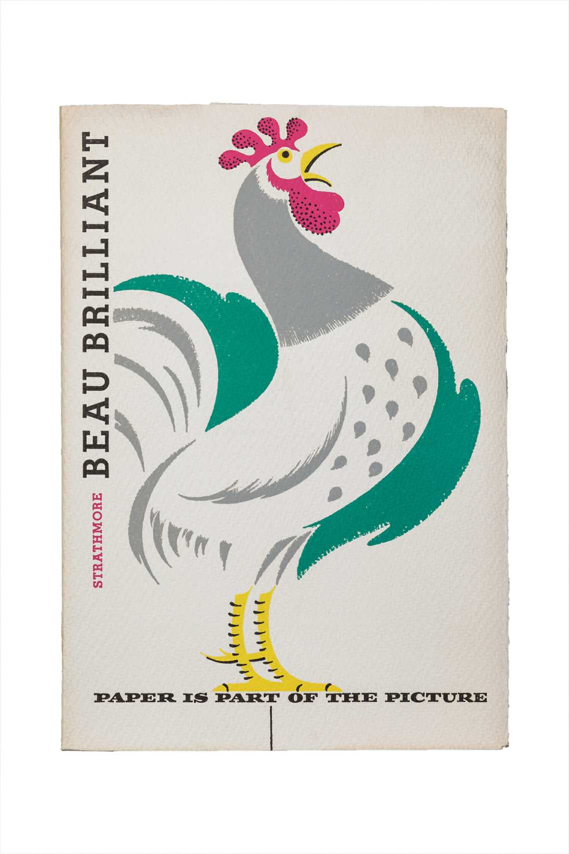
First, a little history. Moses was astute enough to institute a tradition of commissioning the leading illustrators of the day to create work on Strathmore papers, demonstrating how the right medium can make great design that much greater. And when Mohawk acquired Strathmore in 2005, it soon discovered the Strathmore Archives, a treasure trove of rare, historic and dazzling Strathmore paper promotions spanning over 100 years.
So while National Stationery Show will be showcasing the latest and greatest in stationery design, a selection of the Archives provides interesting counterpoint in the Century: 100 Years of Type in Design exhibit at the AIGA National Design Center in Manhattan. The exhibit, organized by Monotype and designed by Pentagram partner Abbott Miller, celebrates 100 years of incredible type and design.

Mohawk shared a smattering of these gorgeous designs with me, which take us all the way from the Gilded Age to the psychedelic 1960s.


Incredible, no? And you know it will be that much more amazing in person. But tradition dies out when it doesn’t continue to evolve, so Mohawk is today introducing the latest incarnation of Strathmore artistry: Strathmore Notes.

Here the iconic Strathmore thistle takes center stage embossed upon three designs of journals, each with a felt-textured Grandee Charcoal Gray cover and a colorful, hand-sewn spine — and each featuring a different kind of paper: either Strathmore Pure Cotton, with a crisp wove finish and unlined pages; Strathmore Watermark Laid Paper, a luxe, 25% cotton paper with unlined pages; or Strathmore Premium Smooth Paper, with an innovative linear pattern formed directly in the paper.
Each envelope holds four customizable bookplates to really make each journal the user’s own, and every journal is linked to enhanced content via Mohawk Live, Mohawk’s mobile augmented reality app, which can be used to learn more about how the journals were made and the heritage of the Strathmore brand.

So while the paper recipes are over a 100 years old, the overall product is completely of our time. I asked Chris Harrold, vice president business development and creative director, to learn a bit more about the development of Strathmore Notes.
Q. SS: How long did it take to bring Strathmore Notes to fruition?
A. CH: The development of Strathmore Notes began, in earnest, mid-January 2014. Working closely with Jennifer Wilkerson from Aurora Design, we sought to both celebrate Strathmore’s 100 year legacy while making the product approachable and modern. Above all, the journals needed to be made from the finest papers in the current Strathmore portfolio.
Q. SS: What elements of Strathmore’s history were you most inspired by as you brought them to life?
A. CH: Late last year we started to work with the Strathmore Archives housed here at Mohawk. This archive is an incredibly rich collection showcasing not only paper, but remarkable graphic design and printing techniques from 1898 to the present. The papers we chose were all selected for their historical significance in the evolution of the Strathmore brand. In fact, Grandee, which is used on (the) covers, has been a staple in the product line since the 1920s. And the wraps on each journal cover were designed with thistle marks we pulled from the archives collection. Our Pure Cotton journal covers (for example) feature a thistle design from a swatchbook cover dated 1917, which has been updated with a bright orange and red color scheme.
Q. SS: Do you have a favorite of the three? Why?
A. CH: Wow … this is a tough question. I like them all for very different reasons. The pure cotton journals are incredibly special because they are like the ultimate luxury for note taking. The 25% cotton laid watermarked papers look and feel like old-school fine stationery, while the linear patterned smooth journals feel very fresh and modern. Because they all feel equally special but equally different in your hand, I think they will all be adopted according to taste and use.
Journals are available in three sizes: small, 3.5 x 5.5 inches, 48 pages ($9.95); medium, 5 x 8.25 inches, 76 pages ($12.95); and large, 7.5 x 10 inches, 96 perforated pages ($15.95). They are available at Mohawkconnects.com and select retail locations.
Oh! and if you have a shop and are interested in carrying these, email Kara.Moschetti@mohawkpaper.com


