


If form follows function, then the Go-To Notebook from Chronicle Books embodies this well-established design maxim. In collaboration with Mohawk, the Chronicle design team has attained the perfect balance of form and function in this new product.
To craft it, Chronicle’s creative team brainstormed about what would comprise the ideal notebook — and ultimately that approach is what enables the Go-To Notebook to live up to its name, setting it apart from the dozens of other notebooks and journals available. Isolating those archetypal qualities is far more difficult than it appears on the surface — but every element that went into the Go-To Notebook was carefully considered and meticulously executed to elevate the humble journal into its most idealized form.
“We could not let go of the (elusive) notion of the perfect notebook, something more sophisticated from all the rest in the market,” explained Michael Carabetta, Creative Director at Chronicle Books, “So, we focused our efforts on building the ideal notebook, one that you would go to, time after time. Thus the name, Go-To Notebook.” The Go-To is designed to be one’s constant companion, ready to record the next great idea regardless of where the user finds him or herself. “In surveying what was out there, we concluded we did not want a hardcover notebook — too formal and too heavy to carry,” observed Carabetta. “We wanted something friendlier, more like a paperback book, and something with some flexibility in the cover boards. In the end, we arrived at a design that has the look of a hardcover book, but the feel of a paperback with some extra features not often found in run-of-the-mill notebooks.”
 The tactile fabric covers evoke literary classics, but are updated in slate grey or persimmon orange. “We were eye-weary of the plain black notebooks that proliferate the category, so we explored the idea of a textured cover stock,” recalled Carabetta. “At first, we explored textured paper but in due course we opted for cloth for the case wrap.”
Even the quantity of the Go-To’s pages was rigorously scrutinized — “physically, not too thin, nor too thick was our preference,” Carabetta noted.
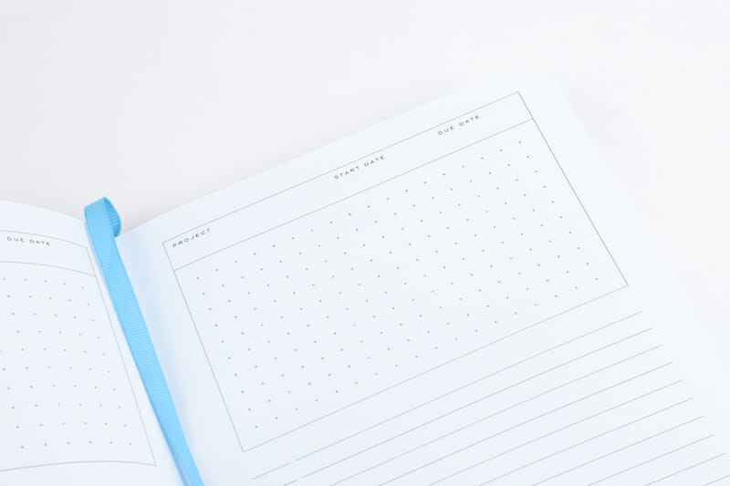 A contents page kicks off each journal, followed by project planning pages printed on Mohawk Via Light Blue as well as tracking pages. This division of labor was devised to make the notebook a powerful productivity tool. “We thought of ourselves as typical users of this product, people who take notes, sketch, and ultimately make things,” Carabetta described. “So we built in a series of project pages, produced in a different paper, providing a means to record an overview of projects.”
Then it’s on to a sea of Mohawk Superfine, quite simply the finest paper made today, in either dotted or lined pages. Superfine was actually not the first choice, Carabetta detailed. “Our initial design exploration was focused on the Strathmore brand. Over time, our focus shifted, as Superfine was celebrating its 70th anniversary. It should also be said that Superfine enjoys an elevated reputation in the design and printing communities, something we thought we could build a story around. In the everything-digital world we inhabit, tactility is paramount, and we felt Superfine was an appropriate choice in this digital-tactile dichotomy.”
Lay-flat binding, a storage pocket and a ribbon page marker are the kind of details people tend not to necessarily seek out, but over time those little luxuries make the notebook the ultimate in user-friendliness.
 As a crowning touch, the chamfered edges lend them an understated, architectural flair — and blend practicality with unexpected aesthetics. “If you carry round a notebook long enough the covers become dog-eared,” pointed out Carabetta. “To preclude that, we beveled them.”
Interestingly, the Go-To Notebook arose out of a chance meeting between Mohawk and Chronicle in New York at National Stationery Show, Carabetta recollected. “At the time, Mohawk had produced some Strathmore paper notebooks for their own use. We were intrigued by this notion of a paper mill producing its own brand of notebooks, and wondered if there was an opportunity for us to explore this idea together in greater depth. So began the collaboration. To get the ball rolling, we visited the Mohawk paper mill in Cohoes, New York, and delved into the Strathmore archives as a potential source of inspiration.”

The notebooks encapsulate both brands’ strengths: Chronicle’s book design expertise and Mohawk’s dedication to making some of the world’s finest papers. “Aside from traveling in the same circles — the makers’ world of design, paper, and fine printing — we share values around well-designed, well-made products,” finished Carabetta.
“The way Mohawk and Chronicle talk about their materials, our obsession with details gave us a level of comfort, a mutuality that is key to a collaborative working relationship. Everyone at Mohawk has been supportive of our joint efforts, offering critiques and envisioning marketing opportunities. We look forward to working with them on future projects.”
[amazon_link asins=’0811870197,1452164614,1452113718′ template=’ProductCarousel’ store=’us0479-20′ marketplace=’US’ link_id=’0215bdc5-af00-11e8-826d-6dec84dda608′][amazon_link asins=’1452151989,1452151865,1452143064,1452134340,1452167648,1452121524′ template=’ProductCarousel’ store=’us0479-20′ marketplace=’US’ link_id=’1f5c6696-af00-11e8-8af4-b90f7e588995′]

